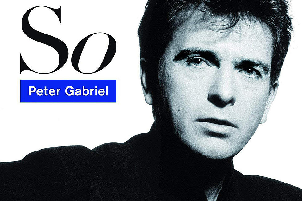
How Peter Gabriel’s ‘So’ Artwork Defined Him for a Decade
The designer who oversaw the artwork for Peter Gabriel’s 1986 album So was called in only after the time and money for the project was almost entirely used up.
Renowned album artist Peter Saville received a call from his creative partner Brett Wickens when attempts to complete the sleeve using the title Good had failed. Despite that, he managed to come up with a concept that, he argued, defined former Genesis frontman Gabriel’s image for a decade.
“They’d used up the time, spent lots of money and it wasn’t ‘good,'” Saville said in a 2003 interview republished recently on Gabriel's website. “The result was that Brett and I drove down to Bath one evening to see Peter. This was my first meeting with Peter, and he was lovely. I said, ‘Look, I don’t really like this. Can we just start again?’ I guess I came across as fairly positive, so Peter said, ‘Okay, let’s do it. Let’s start over.’”
As the pair left, Gabriel gave Wickens a cassette of the record as it stood, saying he thought it was finished. But when Wickens went to play it in the car, Saville had objections – his visit to Bath brought up some unpleasant memories, and they’d also just witnessed a serious traffic accident, so he wasn’t in the mood to listen to the music. “But Brett said, ‘Come on, it’s work,’ and I acquiesced.
“The first track was ‘Red Rain,’ and if you’re in a sensitive mood and you’ve just seen a car crash and you hear ‘Red Rain’ for the first time … it’s quite like, whoa! There was a real passion in Peter’s voice, and it was very listenable. I didn’t mind it. As we approached the motorway, ‘Sledgehammer’ came on. We stopped the fucking car on the slip road! You know when you’re hearing something important. … Brett and I just looked at each other and then looked at the cassette player and almost simultaneously we said, ‘That’s a number one single!’ It was fucking brilliant.”
The experience reenergized Saville, who threw himself into the work. On being told that Gabriel knew he’d “written songs … which crossed over to other people who were not Peter Gabriel fans,” the designer concluded it was time for the musician to appear on an album cover in unobscured form.
With two weeks left to deliver the work, Saville and colleague Trevor Key arranged a photo session with Gabriel. Saville had an idea that a new film product from Polaroid might be the medium they needed, having used it successfully with other artists in the pre-digital era.
“Trevor sat Peter down to do a traditional tripod portrait and it looked awful,” he recalled. “To be honest, Peter came out looking like a middle-aged Wiltshire farmer. So I said, ‘Look, get the Polaroid out.’ … Trevor reluctantly put Polaroid roll film in his 35mm. I reckon we had the cover of So in two rolls. That’s the brilliance of this film. It looks great, and the person having their picture taken sees the result instantly. Peter’s a good performer. If you give him something to aim at, he’ll deliver. He saw himself looking cool, looking groovy, and he and Trevor got it within an hour.”
Released 35 years ago this week, So reached the Top 5 in most parts of the world, making it to No. 2 and going five-times platinum in the U.S. "That picture is – well it was anyway, for many years – the public image of Peter Gabriel, the benchmark image that lasted Peter for nearly 10 years," Saville noted. "It made him look contemporary, young but grown up - mature.”
Genesis Solo Albums Ranked
More From Ultimate Classic Rock


