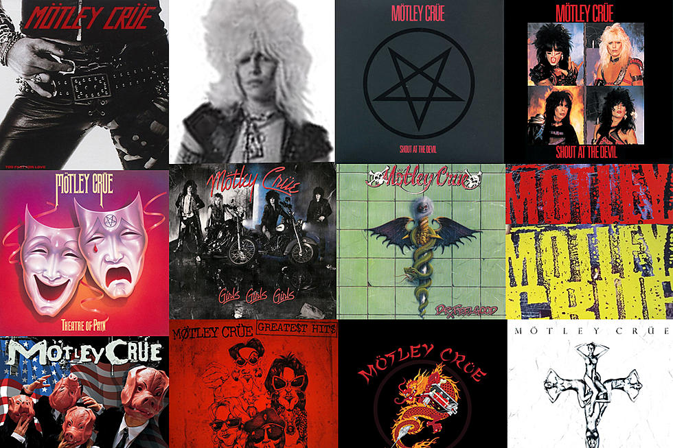
Motley Crue Album Art: The Stories Behind 12 Infamous LP Covers
There are three constants in Motley Crue's world: change, controversy and chaos.
Each of these forces is represented on at least one cover of the band's nine albums. From the close-up of singer Vince Neil's crotch on 1981's Too Fast for Love to the naked, silver-painted women on 2008's Saints of Los Angeles, Motley Crue have consistently paired their music with provocative cover imagery.
They also never stayed in one place for long, changing their look and sound for each new record. In stark contrast to fellow hard-rock titans like Kiss and Iron Maiden, every Motley Crue album featured the group's name re-imagined with different fonts and logos.
"We never wanted to be one of those bands where the first album looked, sounded and smelled like the fourth album," bassist and primary songwriter Nikki Sixx told Orlando Weekly (via BraveWords) in 2003. "It was very important to embrace something, envelop it and then abandon it. Our interpretation of art was that we don't want you to know what you're gonna get every time. Although everyone would complain about us changing, soon after we did something, every other band was changing too. And the people that were following didn't have a clue as to what we were representing."
There was controversy too. The pentagram on the cover of their 1983 breakthrough Shout at the Devil landed them a starring role in a 1985 report named "The Devil Worshipers" on ABC's 20/20. It was later replaced by an alternate cover with the band members posing for individual photos like a warped, parent-terrifying version of Let It Be-era Beatles. Tears of blood, motorcycles, horrific car crashes, scary creatures and naked women would grace the cover of the band's later records.
But as you'll see below in Motley Crue Album Art: The Stories Behind 12 Infamous LP Covers, for sheer shock and awe nothing topped the impossible mountain of hair sported by Neil on the inside of their first album.
More From Ultimate Classic Rock


